Color Stories: Earthy Neutrals in Italian Design

Timeless tones drawn from the Italian landscape, reimagined for the modern interior.
In Italian design, color isn’t just a finishing touch, it’s part of the architecture of atmosphere. Every hue carries a cultural memory, a tactile reference, a sense of permanence. And among all palettes, it’s the warm, earthy neutrals, inspired by stone, clay, wood, and sun-bathed walls, that quietly define Italian elegance.
 (Tudor Sofa and Ottoman by i4Mariani)
Today, we explore how these organic tones form the foundation of Italian interiors, and how designers can use them to create spaces that are serene, grounded, and enduringly sophisticated.
🏛 Rooted in Nature, Architecture, and History
 (Siena, Italy)
The Italian landscape offers a palette as old as time: from the ivory shimmer of travertine to the soft rosé of aged terracotta, from golden-toned plaster façades to the limestone whites of coastal towns. These hues are deeply linked to Italian heritage, they show up in Tuscan villas, Roman ruins, and Venetian palazzi.
 (Lorelei Lounge Chair by Giorgetti)
More than just aesthetic, these colors feel lived-in and human. They’re the result of light interacting with centuries-old materials. Their beauty grows with time, like patina on bronze or weathered stone. They ground interiors in a sense of permanence, nostalgia, and tactility.
🎨 A Canvas for Contrast

(Smart Sofa by Costantini & Pietro)
Earthy neutrals aren’t about sameness, they’re about balance. They allow richer materials to shine and textures to tell stories. Deep walnut woods, burnished brass, dark bronze, or even charcoal metals gain depth when placed against warm, desaturated backgrounds.
 (Flatiron Table by Bonaldo)
Designers often layer tones within this neutral spectrum, from ivory to sand, ochre to sienna, to add subtle rhythm. Texture becomes more noticeable, light plays a bigger role, and restraint gives way to richness. This is the Italian approach: a quiet harmony where everything has space to breathe.
🪑 Furniture That Embraces the Palette
 (Diver Desk by Bonaldo)
Italian furniture brands excel at working within this earthy language. Sofas in muted camel and buttery taupe, sideboards in smoked oak or clay-lacquer, ceramics glazed in sandy tones, all effortlessly merge into warm, sophisticated compositions.
 (Tonic Trolley by Cattelan Italia)
You’ll find boucle in soft cream, beige travertine tables, ceramics in dusty rose, and artisan pieces that don’t fight for attention but invite a closer look. These objects blend, not fade, designed to endure, not to dominate.
 (Forest Table and Demetra Bench by Rugiano)
The natural palette is often paired with organic silhouettes and materials: round-edged tables, low seating with generous curves, raw-edged stone, and linens that feel sun-bleached. Together, they create spaces that feel open yet intimate, minimal yet soulful.
☀️ Light Matters
 (Pepita Suspension Lamp by Bonaldo)
Italian interiors are designed with light in mind. Whether it’s the glow of the Mediterranean sun or the filtered light of a northern Italian apartment, natural illumination transforms neutral tones throughout the day, from soft gold at sunrise to crisp white at noon, to amber as evening settles in.
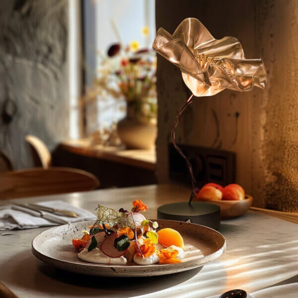
 (Chouchin Suspension Lamp by Foscarini)
 (Spokes Suspension Lamp by Foscarini)
This relationship with light brings a quiet dynamism. Earthy neutrals don’t just sit still, they evolve. Walls change mood, surfaces respond. This is why Italian interiors feel alive and emotionally resonant, even with a minimal palette. The design doesn’t impose; it collaborates with its environment.
🎯 Less Noise, More Emotion

(Gordon Keramik Table by Cattelan Italia)
At the heart of Italian design is an appreciation for restraint. Earthy neutrals are not a compromise, they’re a conscious design choice, a decision to let form, material, and light speak clearly.
 (Borealis Suspension Lamp by Italamp)
Instead of chasing novelty, these palettes offer timelessness. Instead of high drama, they offer intimacy. With the right balance, even a quiet color can become the most powerful voice in the room.
For designers seeking warmth, elegance, and emotional resonance, earthy neutrals are not just a backdrop, they are the foundation.
🔗 Discover More Design Stories →